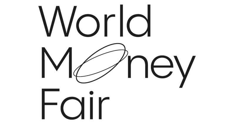
Berlin — The world’s largest coin fair, the World Money Fair, is
now presenting itself with a new, modern look. The corporate design focuses on
the new logo, which features a moving and rotating coin. “This logo is a simple
and concise symbol for the World Money Fair and embodies the dynamism and
global reach of this event, which is of world importance for international collectors
and the coin industry,” says Goetz Ulf Jungmichel, the fair’s new managing
director. The key visual of the trade fair is also formally derived from the logo
and interprets the coin in a modern graphic way. “We also want to offer
exhibitors and visitors to the World Money Fair ’24 more structure with the help
of a modern design and, above all, offer new guests of the coin fair better
orientation,” adds Jungmichel. The new appearance was developed by the
Stuttgart advertising agency BRUCE B.